Testing Narratives
Thursday, December 10, 2020
“Democracy is not a state. It is an act.” ~ Congressman John Lewis (1940-2020)
Introduction
This final week, as states around country certifies the final election results, we move past the analysis of our predictive model, and grapple with narratives presented by media and election analysts. In particular, we formulate a narrative about “nationalized” elections and test out county-level data to understand if this narrative warrants further investigation.
The tale of nationalized elections
This semester we spent a lot of time thinking about fundamentals, population dynamics, turnout and many other factors while trying to predict presidential election results. However, presidential elections do not happen in a vacuum. They are so many down-the ballot races that are happening around the country, including Congress and local government races. While those races are affected by local issues, the general trend of local races might help us predict presidential races, or vice versa. Here is how The Washington Post described this phenomenon:
Candidates can matter even in nationalized elections
As political scientist Dan Hopkins and others have shown, increased partisan polarization and the decline of local news has increasingly “nationalized” elections: Most people vote now for the same party up and down the ticket.
But this doesn’t mean that candidate attributes don’t matter at all: Ideological moderation and strong personal brands can still net candidates a few percentage points on margin. For example, Maine’s Republican Sen. Susan Collins outperformed the president’s vote by some 20 percentage points. And in Kansas, moderate Democratic state Sen. Barbara Bollier fared roughly 4 percentage points better than Biden. Moderate Republicans won gubernatorial elections in Vermont and New Hampshire.
Our narrative test
To test this narrative, we decided to follow the following test: if there is any potential relationship between the county popular vote share in the presidential and state elections, we should observe a correlation between those two figures in most counties. That would give us an indication that this narrative might be true.
Getting the data
Compiling the data proved quite labor intensive. We collected data for the total vote counts and candidate/county-specific vote counts for all counties in the presidential and senatorial elections. Because congressional districts do not align with counties, we chose not to include House elections. Then, we matched the county names in those two datasets to compare them, after computing the popular vote share of Democrats in each election. In Senate races in Georgia and Louisiana with multiple candidates, we had to add up candidate results to compute the total Democratic vote count.
Result analysis
Comparing the county-level popular vote share of Joe Biden and the respective Democratic Senate candidate in contested seats, four main trends to emerge.
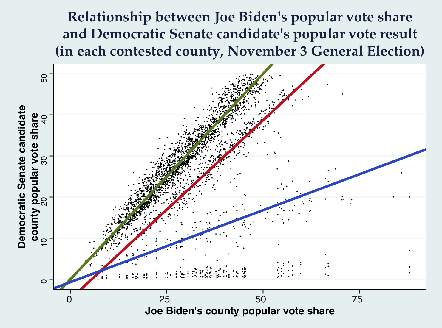
Firstly, we can detect a strong linear relationship for many of the counties that show a potential almost completely matching relationship between the presidential and the Senate results (green line: intercept 0, slope 1). This shows us that in those races there is a close relationship, meaning that the vote is consistent down the ballot, however, there could be other interpretations to this apparent correlation, and not all data can be fitted with this line.
Secondly, there is a second group of counties that have some strong relationship between the presidential and Senate results (green line: intercept -4.8, slope 0.87). There is also a third group of counties that present a strong Biden popular vote share, but do not show a strong performance by the respective senatorial candidates (blue line: intercept -0.7, slope 0.35).
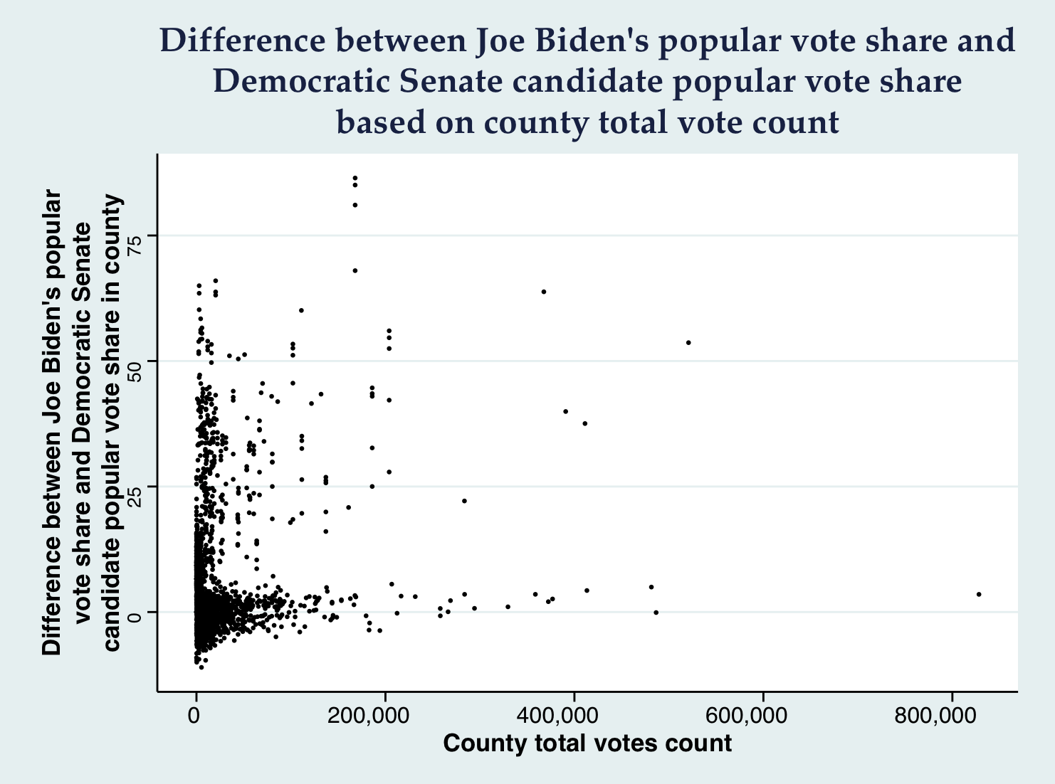
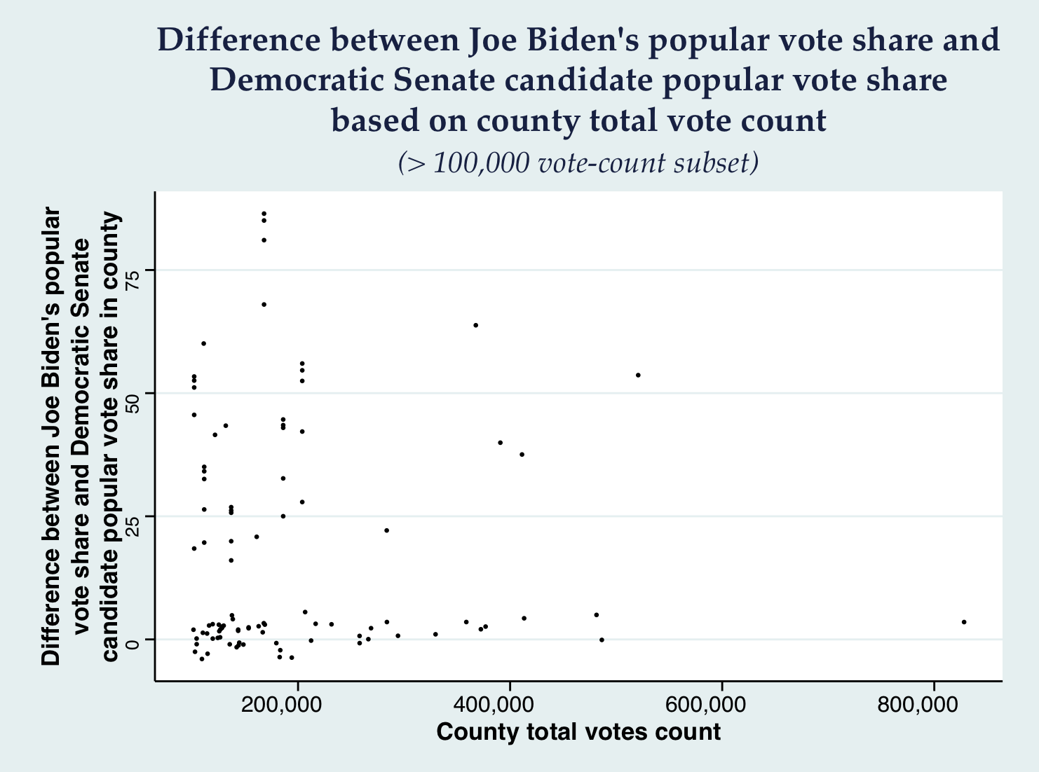
It is also interesting to observe that the differences are mostly positive, especially the larger counties, meaning that President-elect Joe Biden usually performed considerably better than the respective Senate candidates.
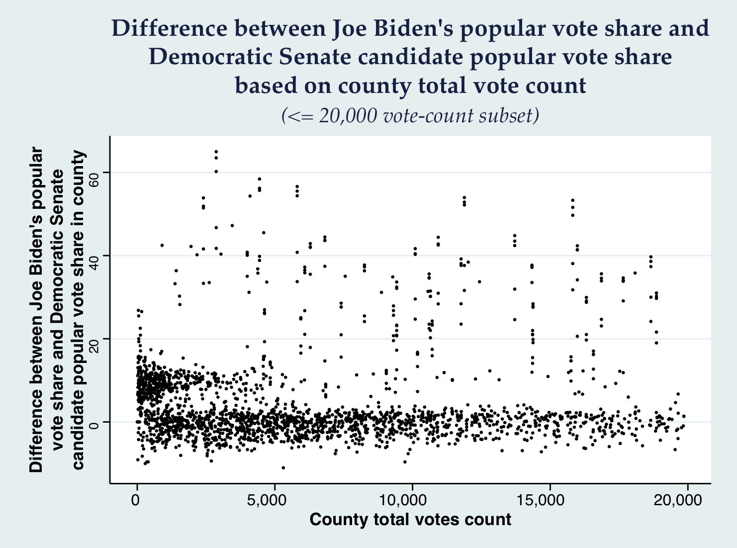
Finally, we observe that smaller counties, which might be better documented in terms of data accuracy (our data cleaning might not have been 100% accurate), are tightly gathered around the 0% difference mark, and also show that tendency to towards a positive difference.
All these claims point to the direction of our claim being plausible, albeit not proving it in any sense.
Onwards
This claim could be further investigated by looking at data from previous elections to understand if similar patterns appear, or compile House election vote count data that correspond to counties to compare those popular vote shares to those of President-elect Joe Biden.